Securing a MySQL database using PHP
Video:
Look at this page on your laptop/pc to watch the video!
Preparation:
I began this project by taking an online course on the fundamentals of web security. Here, I learned about a lot of different prevention techniques. I learned about variable session IDs and secret IDs, neutralizing SQL metacharacters, using prepared statements, what null-bytes do, regular expressions (RE/regex), metacharacter handling, and HTML encoding.I learned to “never trust user input” and to “never massage invalid input.” I got a lot of information on blacklisting and whitelisting, log monitoring software, and Cross-site Scripting (XSS).
In the part about encryption, subjects like symmetric and asymmetric cryptography, the RSA algorithm, hashing (input/passwords) and salting it, Collision Resistance, digital signatures, and the benefits of multi-factor authentication are discussed.
Lastly, in the part about (types of) database attacks, I learned about cookies and storing login credentials in them, (types of) malware and (types of) web trojans, Referer headers, and creating a ‘ticketing system’ (CSRF token generation).
Because I had built a MySQL database before, I could use it as a template to learn and apply web security. After setting practical goals for what to create and how to achieve this, it was finally time to start practically!
Securing against attacks from different IP addresses:
I started by tying the session ID to the IP address of the client. This will not protect against attackers who hide behind the same web proxy as the victim, as all requests from the same proxy will come from the same IP address, but it should protect against attackers on different IP addresses.I modified the code for the IP check to allow minor IP changes—like when the first three octets of the IPv4 address stay the same (a /24 subnet). This way, mobile users, users on the same local network, or with dynamic IPs, aren’t logged out unnecessarily.
For this, I added a sameSubnet() function to compare the first three octets of the IP. The session is only invalidated if the user moves outside that subnet. This reduces false positives for mobile or dynamic IP users while still protecting against session hijacking from distant attackers.
The web app stores the client’s IP on the first visit. Then it checks the IP on every request. If the IP changes outside the same /24 subnet, it sets $_SESSION['ip_changed'] = true and logs a warning: “Session IP changed from {$_SESSION['client_ip']} to {$client_ip}. For safety reasons, you have been logged out."
I used robust IP detection using HTTP_X_FORWARDED_FOR for proxies.
Neutralizing metacharacters:
For the neutralization of metacharacters, I first started by neutralizing them manually, but this was not safe enough:function SQLString($s)
{
$s = str_replace("'", "''", $s);
$s = str_replace("\\", "\\\\", $s);
return "'" . $s . "'";
}
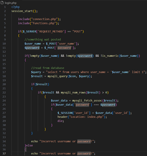
Instead, I have used a prepared statement:
function SQLString($con, $s)
{
return "'" . mysqli_real_escape_string($con, $s) . "'";
}
MySQL’s native escaping covers all SQL metacharacters that matter. It escapes:
- ' → \'
- " → \" (when in string context)
- \ → \\
- \0 (NULL byte)
- \n (newline)
- \r (carriage return)
- \x1a (Ctrl+Z, EOF in Windows)
This way, it neutralizes all dangerous byte sequences that could break out of a quoted string in MySQL. This is much safer than manual replacement.
// General safe query runner
function run_query($con, $sql, $types = "", $params = []) {
$stmt = $con->prepare($sql);
if ($stmt === false) {
die("SQL error: " . $con->error);
}
if ($types && $params) {
// spread operator to unpack array into arguments
$stmt->bind_param($types, ...$params);
}
$stmt->execute();
$result = $stmt->get_result();
return $result;
}
This function makes sure, I only have to write one helper for the checking of metacharacters in functions.php, which works with any script (login, signup, profile, etc.) and can safely run queries with parameters.
Input validation:
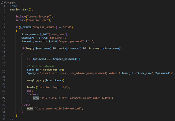
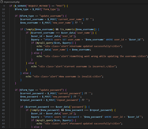
I continued by adding username validation. Usernames now only allow a-z, A-Z, 0-9, _, and 3–20 characters. I made sure that if the chosen username already exists in the users table, the signup fails gracefully and tells the user to pick a different one. I implemented this because usernames are typically required to be unique.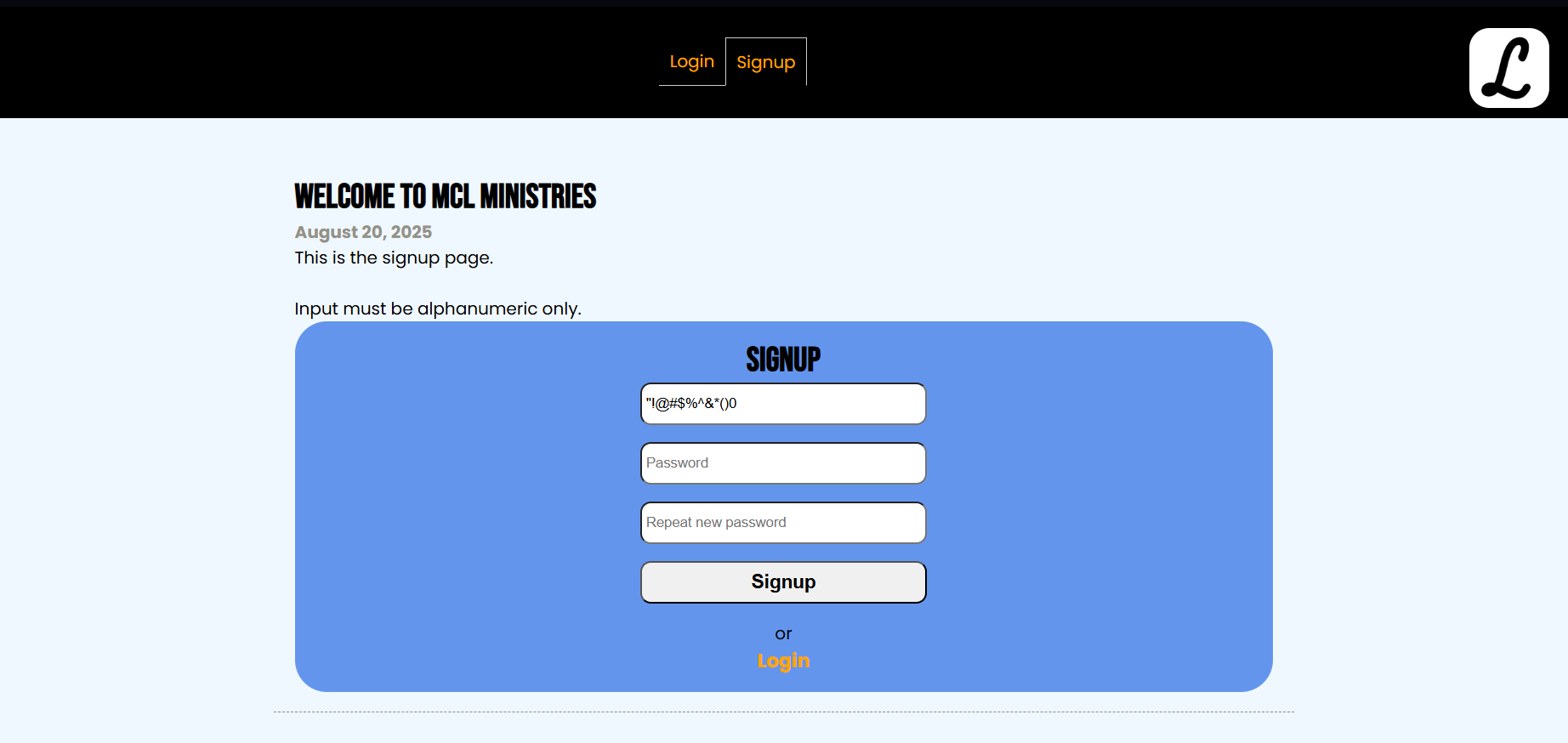
I also protected the other pages against SQL injection and XSS. Fields are validated both client-side (required) and server-side, and feedback ($message) is shown in the .alert div.
For example, on the Results page, a dropdown list is used. A malicious user could easily bypass the dropdown restriction by editing the HTML in their browser (e.g., with dev tools) and crafting their own POST request with curl, Postman, Burp Suite, or even JavaScript. I used prepared statements for any database queries to prevent SQL injection, even if attackers send junk, and added a whitelist check. Whitelisting is identifying good data and filtering the rest. It implements what could also be called “deny by default”.
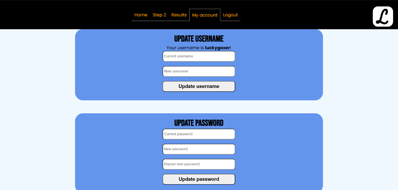
Another example is on the My account page. Using htmlspecialchars on the updated username before echo prevents XSS. When dealing with HTML, the escaping of metacharacters is called HTML encoding. All dangerous user input, like usernames, has been HTML-encoded to prevent XSS. I have also made sure to refresh the session when the username changes.
I have created a central helper function in my functions.php script that validates user input. This will handle:
• Maximum length
• Minimum length
• Optional numeric-only or alphabetic-only checks
• Trimming whitespace
I replaced the regex (regular expression) check with validate_input() for consistent min/max length checks. I used validate_input() for both username and password. Usernames must now be alphanumeric (but you can still add _ if you want). All database access is via prepared statements (run_query()) to maximise security.
Securing passwords:
A password is now required, and passwords must be 6–255 characters. I implemented password policy checks for minimum length, containing at least one uppercase, lowercase, a number, and a special character. The server rejects weak passwords, and the user potentially gets feedback on what to change when their new password is submitted.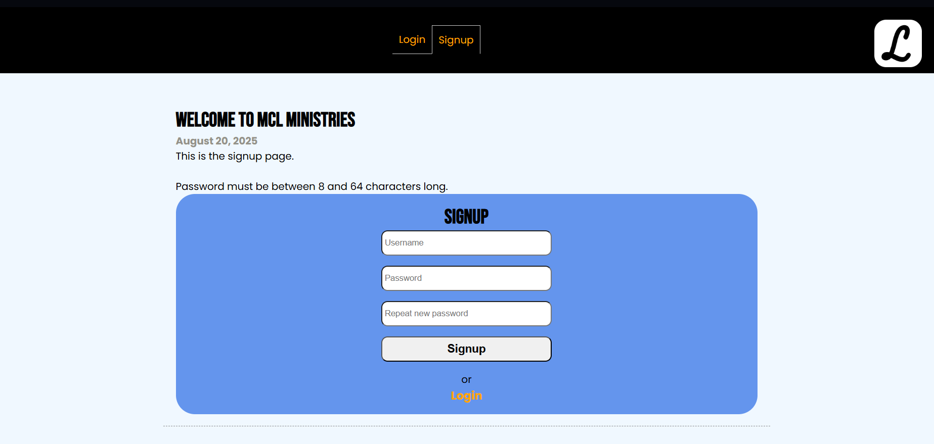
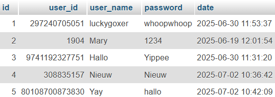
The biggest change is that all passwords are now hashed and verified securely. Hashing is a one-way function that converts a password into a fixed-length string that cannot be reversed. password_hash() automatically generates a unique salt for each password. It uses strong algorithms like bcrypt. Here you can see the former clear-text passwords and the new hashed passwords.
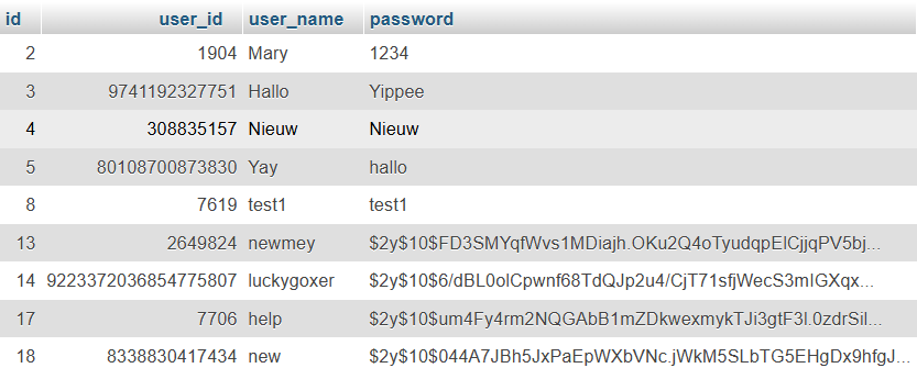
A salt is random data added to a password before hashing. It ensures that even if two users have the same password, their hashes differ. password_hash() automatically generates a salt internally, so I didn’t have to manage it manually.
When verifying a password, password_verify() extracts the salt from the stored hash. It hashes the input password with the same salt and compares the result with the stored hash. Only if the stored hash and result match will the user be logged into the application. Using hashing and verifying, passwords are now safely secured.
So, in short, a user's authentication is achieved through a system that passes the password through a one-way hash function and stores the fingerprint of the password in our database. Whenever the user wants to log in, it takes the user-provided clear-text password, passes it through the same hashing function, and compares the result with whatever is in the database.
Because the salted and hashed passwords are stored in the database, clear-text passwords are never stored in the database. Passwords are also never stored on the same database the web application uses: the application’s PHP files are on the disk in Apache’s folder, and the users’ credentials are inside a MySQL database.
Adding a ticketing system:
Lastly, I added a ‘ticketing system’ (CSRF token generation) to protect against Web Trojans. A token is included in every form and is validated when submitting the form. This way, only the forms from this application will be accepted, and no forged requests from malicious pages.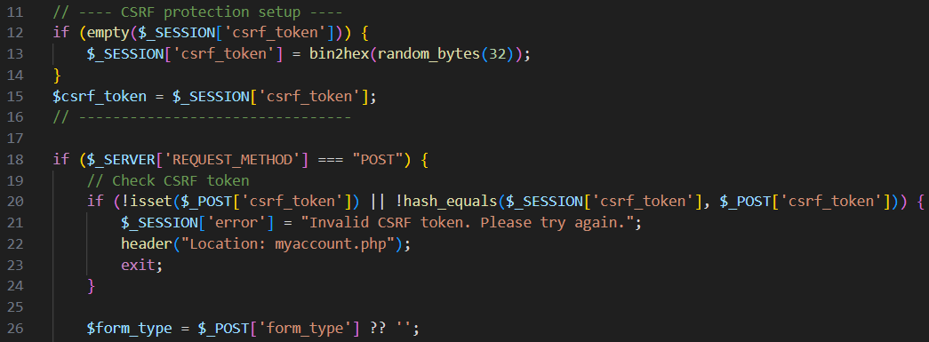
Looking back:
By the end of this project, I have implemented secure input handling by neutralizing metacharacters using prepared statements or escaping functions, to ensure that database queries in my application are SQL injection–resistant. I have also designed and implemented a password security system that enforces a strong password policy and stores user passwords using hashing and salting without storing any clear-text passwords.If I had more time, I would have liked to add log monitoring software to detect brute-force login attempts and catch suspicious activity. Multi-factor authentication would have been helpful to act as an extra lock in case someone guesses or leaks a password. Finally, I would implement secret IDs to stop people from getting access to restricted, server-side resources.
During this project, I further developed my skills in Research, HTML, CSS, Web Design, MySQL, PHP, XAMPP, phpMyAdmin, Web Security, Regular Expression (RE/regex), Metacharacter Handling, HTML Encoding, Cross-site Scripting (XSS) Prevention, Hashing and Salting, CSRF Token Generation, and UI / UX Design.
MySQL database using PHP
Video:
Look at this page on your laptop/pc to watch the video!
Process:
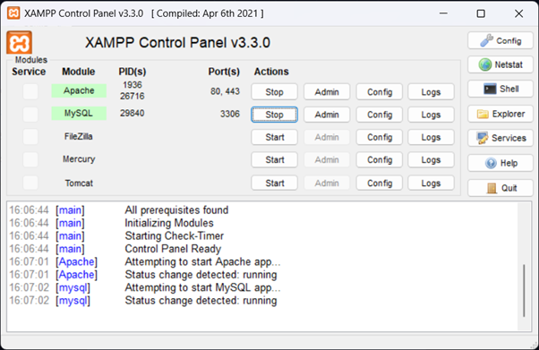
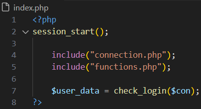
First, I started by learning about frontend and backend web development. I already knew a bit about frontend web development through the Web and Advanced Web modules. For this website, I used HTML and CSS for the frontend. For this website, I used PHP, XAMPP, and phpMyAdmin for the backend. In XAMPP, Apache and MySQL need to be running for the website to function. These function as the localhost server, because Live Server cannot be used to run PHP code. phpMyAdmin functions as a database that stores information like id, user_id, user_name, password, and date. Afterwards, localhost/login/index.php can be loaded and the webpage will be displayed in the browser.Creating a style:
The side job idea:

The first steps in PHP:
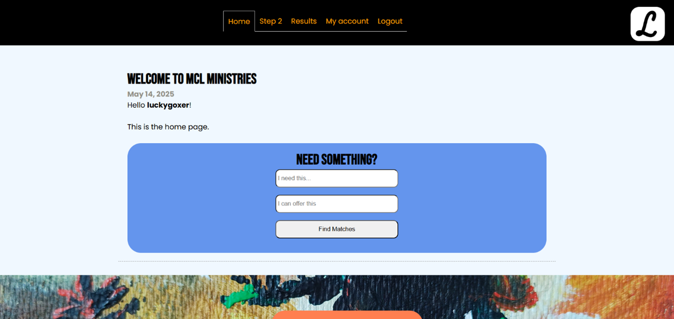
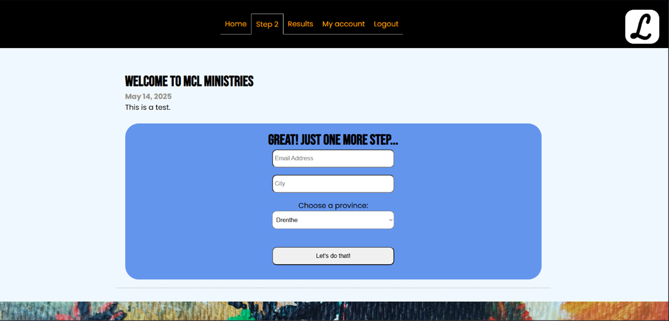
Unfortunately, due to my limited knowledge of PHP and outdated tutorials, I could not complete the side job idea. When the user is logged in, you can still see the pages I made for this idea, called Home, Step 2, and Results. Instead of this idea, I created a login system using PHP.
The PHP login system and database:
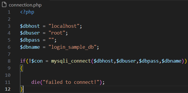
In phpMyAdmin, I created a new database called login_sample_db with a table called users. I added columns called id, user_id, user_name, password, and date.
In the XAMPP folder, I created a folder called login: C:\xampp\htdocs\login and started working on the website in this folder. This way, XAMPP can easily find the necessary documents and localhost the website.
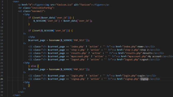
Logging in
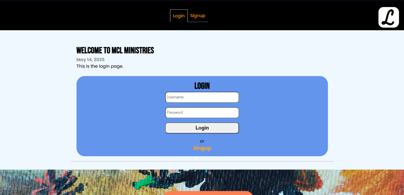
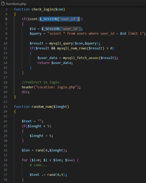
I created a login.php (Login page). This page contains a form for logging in by adding a username and password and clicking the login button.
Signing up
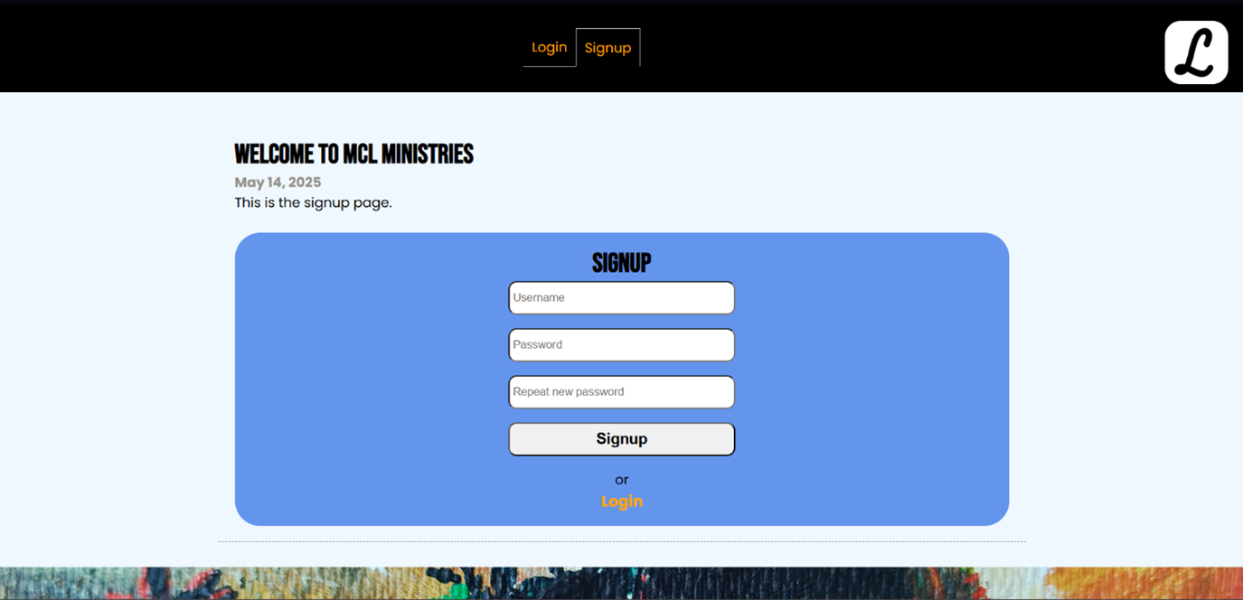
In a
In a
Logging out
To complete the full functionality, I created a logout.php script. This script is accessed by clicking on the Log out button in the header visible on every page. This script simply unsets the user_id and redirects to the login.php (Login page).
Changing my account
Finishing touches:
In the end, I optimised my CSS to make the whole website look prettier and clearer. For example, I made sure the password input styling is the same as the username input. At first, I could not get them to look the same.Looking back:
With all the knowledge I have obtained, I might be able to complete my initial side job idea now. I would like to check if the username is already taken and make the password require specific characters, like adding a capital letter, a special character, and a number. I would also like to add some form of security. Maybe an email address is needed and has to be verified to set up an account, too.I now know how to create a login and logout system using PHP code, and I have learned how to create a database using phpMyAdmin and read and upload information from and to it.
I see a big improvement in my skills, because at first I had no knowledge about PHP and databases at all.
I enjoyed the process, although my first idea just kept on failing. Unfortunately, due to my limited knowledge of PHP and outdated tutorials, I could not complete the side job idea. However, when the user is logged in, you can still see the pages I made for this idea, called Home, Step 2, and Results.
During this project, I learned a lot about Research, HTML, CSS, Web Design, MySQL, PHP, XAMPP, phpMyAdmin, and UI / UX Design.
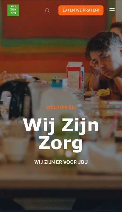
Wij Zijn Zorg
The request:
For this website, I received a request from Wij Zijn Zorg. They needed a website and
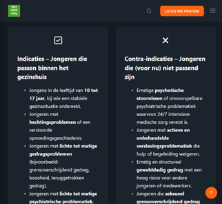
asked me if I could make one. The request was for a family home (gezinshuis)
intended for boys aged 10 to 17 years who lack a stable family situation.
While speaking to the client, he told me he wanted a “tough website” that does not
have to be “too formal or too piteous”. The website should be “a central information
point where the mission, vision and unique care concept are clearly presented”. The
website should contain testimonials, photos of the living environment and practical
information about the registration process. The client would provide all of this to me
himself. The website should be “simplistic, intuitive and cool”, and should have a
header with buttons to the different pages, a quality mark page and a signing up
page. Furthermore, I was given complete freedom and the client assumed that I
would be able to lay a good foundation for the website.
Creating a style:
The client wanted a “tough website”, so I created a color scheme using some orange and blue tones. The orange and dark blue color scheme creates a contrast that works complementarily, making the different elements easy to differentiate. Then I started working on finding a fitting typography. I used a combination of Impact, Verdana, Georgia, and Monospace variations.
Starting in WordPress:
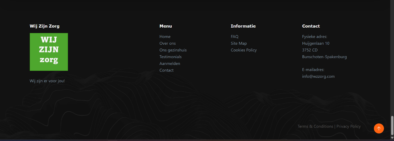
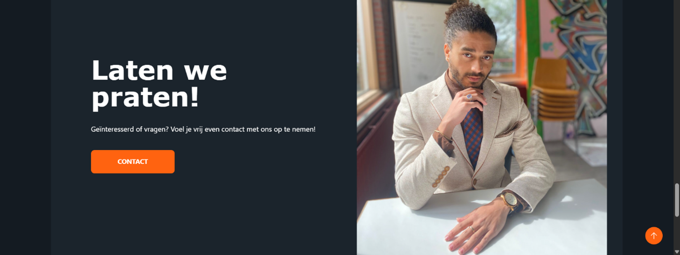
I started working on the header and added a menu at the top. I added content to the home page and a footer and adjusted it to fit the website's theme. Both the header and footer contain buttons to the pages and the logo of Wij Zijn Zorg. I added a magnifying glass as a search option, so the user can search the different contents of the website. I made the contact page button in the header say “Let’s talk!” in the big bright orange color to attract attention.
Pages:
Home page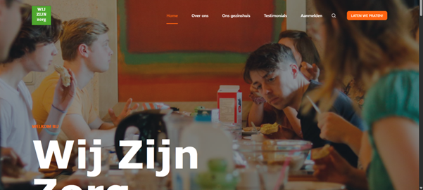
After the home page, I added the corresponding pages: an about us page, family home page, quality mark page, testimonials page, signing up page, contact page
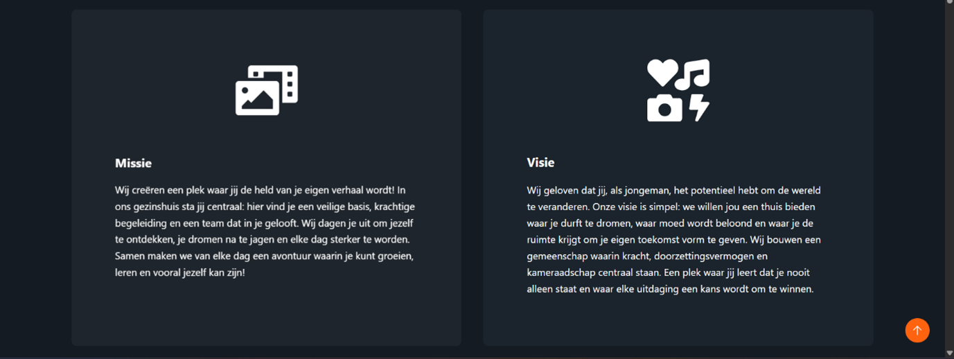
About us page
On the about us page, I added the section for the mission, vision, indications, and contraindications again, as well as a section about competition and a conclusion. I read the full business plan and indication documents and was given the freedom to create a website based on it. The client would provide feedback on what I could add to my picked out information. This way, by analyzing the plan I have also trained my skills in research and learned a lot in the field of the ‘Business Thinking’ course in my studies.
Family home page
I added a page for the family home itself with all sorts of useful information like the surface and how many bedrooms there are. A lot of information about the setting, personal and professional accompaniment, and Christian and authentic identity were provided by the client. I added this information in blocks that are easy to read and distinguish from each other, fitting with the style and theme of the website. I created icons based on the names so it is immediately obvious what the information is about. This way the style is “simplistic, intuitive and cool”, as the client requested. I adjusted many of the paddings and margins too.
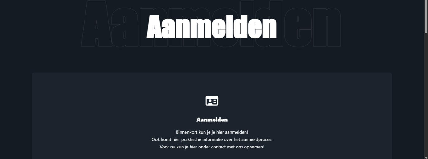
Quality mark, testimonials page and signing up pages
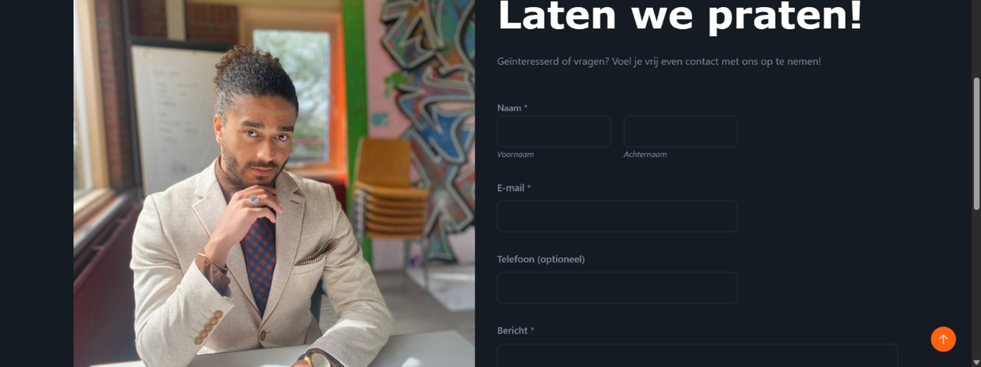
Contact page
Finishing touches
I added some teasers for all pages on the homepage with a snippet of the corresponding information and a button inviting the reader to go to the corresponding page. This way the homepage stays clear, but gives all the information that is needed to know what the family home is all about.
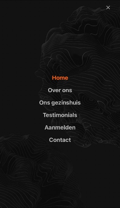
I have optimized the layout for mobile devices by creating a bigger logo in the top left corner, deleting some paddings and margins in the mobile version that were conflicting with other elements, and changing some font sizes to fit on the screen. I also added a hamburger menu fitting with the theme of the website.
I have also optimized the layout for tablet devises, mainly by creating bigger logos and adjusting many of the paddings and margins. Finding the issues were unfortunately a lot of trial and error.
Final draft:
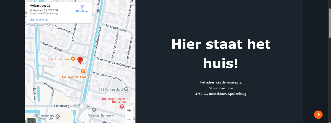
The website is now fully functional. It has a header with buttons to all pages and an emphasis on contacting my client. The homepage gives snippets to all corresponding pages with the option to contact my client. In the footer there is a menu with all pages and the address of the family home. The about us page has a lot of useful information about my client and the family home page has a photo and an interactive map of the location. There is a testimonials page and a signing up page functioning as placeholders until the necessary information is provided. Lastly, there is a contact page with the physical address, email address and a contact form to contact my client.Feedback:
I contacted the client to get feedback on the website and the client was quite impressed with what I have achieved in the time I spend on the website. “I looked at the website. I find the theme really nice!” He liked the style and theme of the website very much and was pleased with how simple and clear the website is while maintaining the theme.The client preferred some different photos and he requested the removal of the quality mark page for now, because the mark is not yet received. He also asked me to change the family home page, because currently a different house is used. Instead of removing these pages, I removed the buttons and links to them and set the pages to private. This made sure no time and work was wasted and I will be able to add these pages back when the time is right.
Finishing up
I implemented all the feedback to the website. I created a similar family home page for the currently used house, with similar information. Because less information on this house could be provided, it is a bit shorter than my initial, now dubbed future family home page.
Final feedback
At the last meeting, luckily, the client was quite impressed and did not want big changes. I have not made major oversight in the process, which resulted in a professional looking finished product.
Once again, the client was very pleased with what I had made and he figured that the website was done for now and ready for use! “Well designed as I described! Really neat, truly my compliments.”
During this project, I further developed my skills in WordPress, Web Design, UI / UX Design, and Gathering and Applying Feedback.
Link:
Check it out on www.wzzorg.nlSpotify Searcher
This application searches the Spotify API to find information. I made this application using React. By building the React application, I turned it into HTML/CSS and JavaScript, so I could implement the application into this website.
During this project, I further developed my skills in Web Design, and React.
This Portfolio Website
About
This page will show how I created my professional online presence. First, I will provide a specific description of my target audience, define the goals for my online presence, and show my strategies. I will show testing sessions, feedback, and how I created fitting solutions to problems that came up. This way I created multiple prototypes and iterations to refine my online presence. Screenshots are included to demonstrate everything I made and how I did it. In the end, I have created a professional personal website serving as a portfolio and resume.
Web
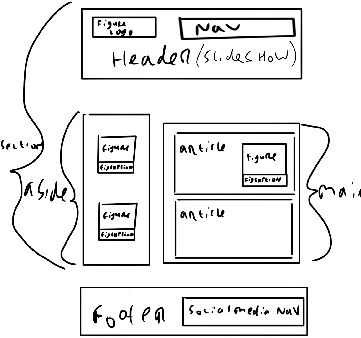
I made a section with a <header>, an <aside>, and a <main>.
I wanted the header to have a <figure> with a logo in it.
I also wanted a <nav> functioning as a navigation bar for the different pages.
I wanted to incorporate a slideshow in the <header> as the background.
The <header> should be position: sticky; so it will stay at the top when the website is scrolled on.
For the <aside>, I wanted <figure>s with <figcaption>s.
The latter would explain what is visible in the picture.
In the <main>, I wanted <article>s with text. If needed, a <figure> with <figcaption> could be added.
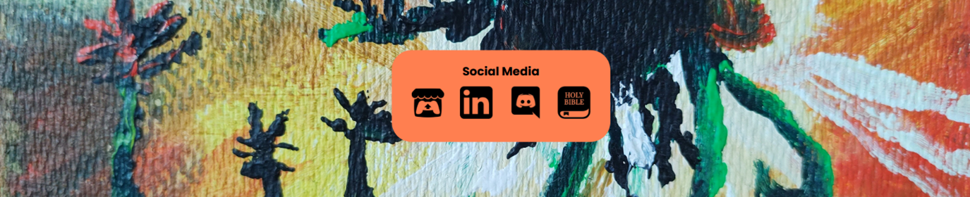
Lastly, I wanted a <footer> with a <nav> for my social media.
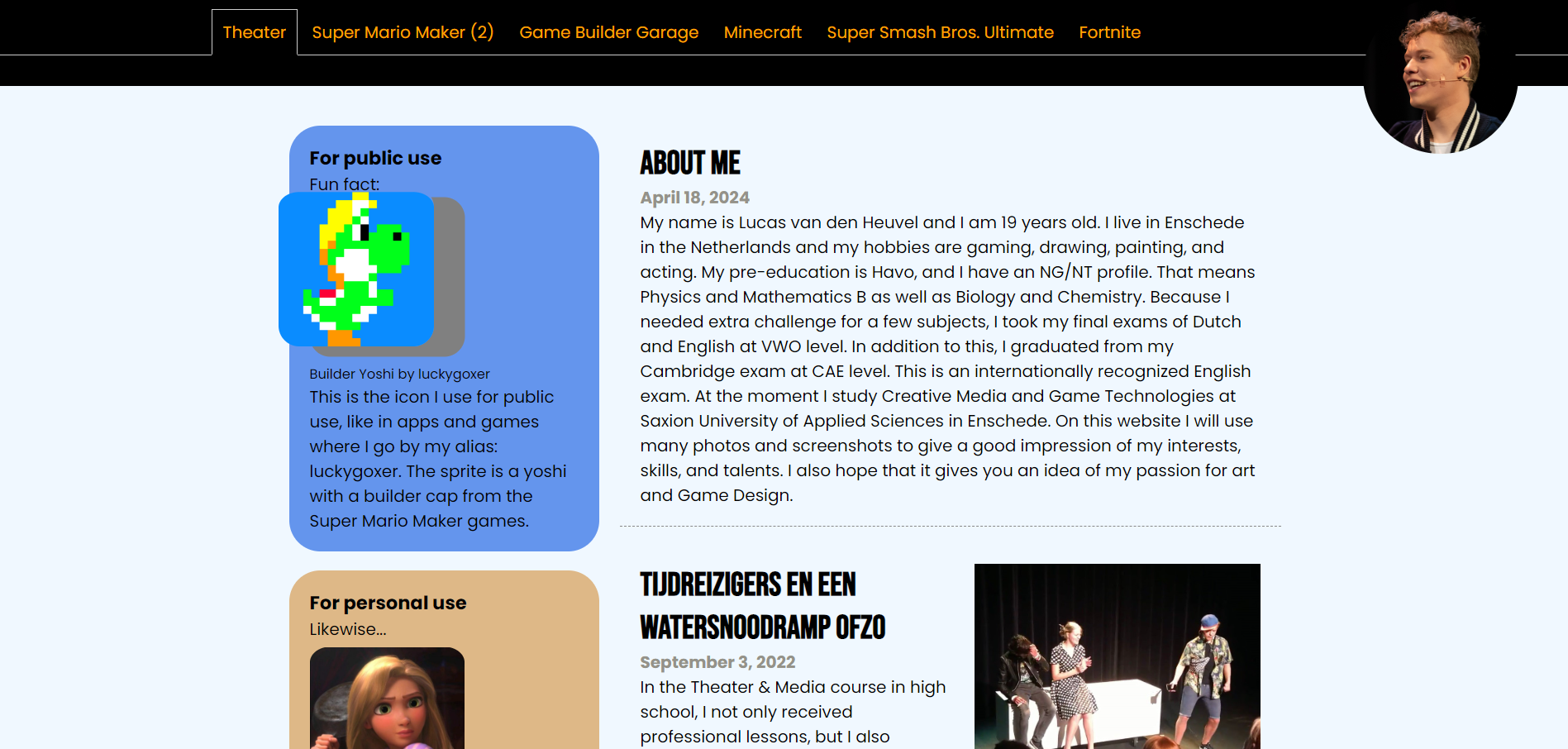
I made an <aside>, with <figure>s with <figcaptions>s and text.
I also created a box-shadow when the <figure>s are hovered over.
The <main> has <article>s with text, and a <figure> with a <figcaption>.
I made the background-color: aliceblue; to be easier to look at.
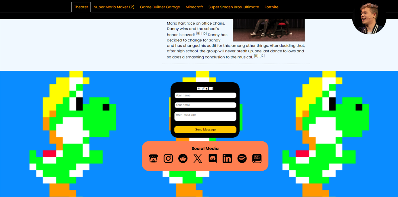
Lastly, I made a <footer> with a <nav> for my social media and even a form to contact me.
Because this was a prototype, some elements were random and not optimized.
Still, many elements ended up in this website; the final product, in one way or another.
Personal Branding
After the Web module, I had a new goal in mind: using this website as a proffessional personal portfolio. I continued to improve the website during the Personal Branding module.In the emphasize phase, I broadened and deepened my insights into the needs and wants of my target audience and the effectiveness of my online presence.
In the define phase, I synthesized my collected information from the empathize phase to specific insights on personal branding, positioning in the work field, and target audience definition.
In the ideate phase, I explored and analyzed design possibilities. I created a range of ideas and concepts and made choices on the effectiveness of my online presence.
In the prototype phase, I made a lot of prototypes for my website. Each time I made improvements to my website.
In the test phase, I did a lot of testing sessions with a wide range of users. This way, I got valuable feedback on how the website should work and look.
After the testing phase, the cycle repeats; emphasizing, defining, ideating, creating a new prototype, and doing another test. Using this long cycle, I created an intuitive and aesthetic website in the end. My online presence now contains a range of portfolio items and is easily accessible and expandable. It is unique and personal and has the personal style that I was hoping to achieve. I hope this website will support me in a potential job application and will form the foundation with which a professional network is created.
In the first emphasize phase, I analyzed others’ portfolios and took inspiration from them. For privacy reasons, I have not included the portfolios of said designers, but I will include my analyses.
- I like that this portfolio starts with an ‘About’ and social media links. I also like that it is clear and to the point, but I don’t like how incredibly simplistic this website is. I think it can have a little bit of personality, as long as it does not take away from the clarity and simplicity.
- I like how the games are displayed with an image, link, about, studio, and platforms. It is easy to understand and clear to see what is going on.
- I like the color in the navigation bar at the top, it makes it clearer than keeping everything the same color. This portfolio is also very clear with a touch more personality.
- I like the color in the navigation bar at the top, it makes it clearer than keeping everything the same color. This portfolio is also very clear with a touch more personality.
- I find this portfolio clear and easy to read due to the use of colors (dark mode, orange text). I don’t like the informal speech to be honest. You can use that for peers, but not in the professional industry.
In the define phase, I decided what my goals were. My goal is to create a professional online presence by creating an online website. I want to update it frequently. This way, it will stay up to date with my skills and knowledge, so employers know who I am and what I am good at.
I want to have an ‘About’ and social media links. I want it to be clear and to the point, while having a little personality, as long as it does not take away from the clarity and simplicity. I want my games displayed with images, links, about, (studio), and platforms, so it is easy to understand and clear to see what is going on. I want to have a bit of color, to make it clearer and give it a bit of personality. You can use that for peers, but not in the professional industry. I am targeting designers because I am aiming for a designer job.
After this, I thought about the product requirements.
Must
- Consistent and personal style
- Contact form
- Social media links
- Gallery of selected work
- Project pages
- Curriculum vitae, redacted for privacy
- About me
- Skills
- Moving slideshows
- Clickable slideshows
Consistent and personal style
- Matching fonts
- Matching colors
- Are there exceptions?
- Name
- Email address
- Phone number (optional)
- Message
- Placement (aside, footer, own HTML contact page)
- What media?
- All my social media or only relevant
- Placement (aside, footer, own HTML contact page)
- What work?
- All my work or only relevant
- Placement (own HTML gallery page)
- What projects?
- All my projects or only relevant
- Placement (own HTML projects page)
- Placement (own HTML experience page)
After this, I have been trying out various styles and color schemes. I settled on a personal style that I was happy with.
Afterwards, I started building different pages. I have tried to stay consistent, while also making every page a bit different.
The hard parts were creating a good layout for the website and getting margins and paddings right. I mainly used W3Schools to gather information about how to fix these. On this website, I have learned a lot about HTML and CSS.
I had not yet finished all the pages of my website, but I had three pages finished. I have used these as the testing prototype. This prototype was the most completed one, so it would give the best indication of what I wanted the website to be like. That is why I have used this one for testing.
In the testing phase, I uploaded my website on luckygoxer.github.io. Unfortunately, my testers lived far away and I was not able to get a look at their reaction. I got a lot of responses, mostly spelling mistakes. One tester specializes in the English language.
This was the feedback that the tester specializing in English gave:
- You must be an Epic Games Creator to upload Fortnite Creative maps. Unfortunately, I am not one me, so I cannot upload my maps for them to try. ('I am not one me' is not correct English)
- In this map you platform, your way through the levels. (Delete the comma)
- and a self-made story about time travelers and a flood in 2022. (There is no start of the sentence)
- Here are our most noteworthy plays. ('Above are our most noteworthy plays' because I showed them above, not below)
- Sustainability (sustaining notes (for clarity))
- August 2020 until May 2023 (I was in high school for a longer time, so August 2018)
- the Havo level (delete ‘the’)
- Art general (history of arts (for clarity))
- Brothers in Christ want to serve teenagers (wants)
- Server (waiter)
- Continue using the (Super Mario-inspired) fonts as used in ‘About Me’ and ‘About Games’
- The scrolling photos for Vettig de Musical are cool
- Use uniform colors, especially for social media logos at the bottom. Some, like Itch, are barely visible when hovering over them.
- Is theater necessary? The focus is on Game Design and getting an internship later. (My solution: this website focuses on Game Design, but not ‘just’ that. Maybe link skills with theater?)
- Make the Contact Me form use one font. Now the name line and the text line for example use different fonts.
- Show more of the process behind your games.
- Delete the shadows when hovering. They’re “ugly and distracting”.
In the second empathize phase, I processed the feedback from the last test. I found it would be appropriate to create a page for my games. This fits with the needs of my target audience; a company that would want to hire me. There was also not a good way to contact me yet. I had social media links and a contact form in mind.
In the define phase, I decided that the page would display who made it, what was made, for what platform, where to download it, and some visuals like pictures. I also want to create social media links and a contact form.
In the ideate phase, I was thinking about creating one page for my games, but I could also make one for every game. I chose to create separate pages, so the information would not collide and get confusing. Also, this way everything stays clear and the page will not be extremely long. For the way to contact me, I could create a Contact Me page, or put the Contact Me form on every page. I chose to put the Contact Me form in the footer on every page except the home screen. This way the form is always there on every page and is very clearly visible on the most important page. I also put my relevant social media in the footer.
In the prototype phase, I started building different pages. I have tried to stay consistent, while also making every page a bit different again, starting with the way to contact me on every page.
After this, I started to work on the individual game pages. I created a good layout that I used for all the games. I also implemented some visuals in the aside after testing different layouts.
The hard parts were creating a good layout for the new pages and creating a unique page every time. I mainly used W3Schools to gather information about how to fix the first issue. On this website, I have learned more about HTML and CSS. At the moment I had all the pages that I wanted to be finished. I have used these as the testing prototype. This prototype was the most completed one, so it would give the best indication of what I wanted the website to be like. That is why I have used this one for testing.
In the testing phase, I asked a quality assurance tester at Nintendo of Europe if he wanted to test my website and this was his response:
It's looking great! I always like seeing people doing it on GitHub, the most convenient way in my opinion and right next to your repositories if you need to show off your programming skills.
I think your portfolio looks good, personally I am never here to judge any style, format or look of a portfolio website. In the end the most important part is that it should give clear information about your skills and capabilities, and projects you worked on. As long as you stick to that it will be good.
I think the only thing I would mention is add what you added to the process and development of your projects, I don't know if they're all solo or in a team but in both cases: talk about what your roles were in the project, if there was a certain objective or goal and how you went about achieving that.
For example it would be great to read more about the design processes behind your projects if that is something you're passionate about. Also for your Mario Maker levels! if there was a certain thought behind it.
I hope that helps, it reminds me that I should also update my portfolio haha
Kind regards
I asked a Game Designer who has been creating Indies for over 10 years for feedback and this was what he told me:
First impression is a good and proeffesional one, but maybe make the contact thingy on the side a bit less colory. Some simple whites and greys would go a long way there. (I think it is fine, because I want it to ‘pop’, because it is the most important thing on the website; the call to action. With this reasoning, the former recruiter/hiring manager agreed with me.)
First thing that pops into the eye on the games page is the yoshi and rapunzel icons. I don't know how to feel about this considering both are other peopls IPs and i assume you didn't make those pictures right? :D Like they are not fanart or anything? Because if not, I would maybe get rid of them since this portfolio should tell people about your skills first and foremost right?
Next: the luckygoxer logo is clearly nintendo inspired. I totally get the energy, believe me. xD But for a potential employer or business partner this is a very heavy red flag. I would much rather use something you came up with entirely from scratch. It's fine if it "doesn't look too good" as long as its yours and has its own identity
The level design page is fine btw (in case you where wondering :D) Since it clearly presents that its about content you created in those games.
Education and courses page would look better if you give the panels on the right the same white and grey treatement i was talking about earlier.
Same for skills. You could also use that blue in all of them if you prefer, it's not too offensive in conjunction with the rest. (I chose this color palette because it doesn’t distract too much from the website, but it does give the website some personality. Using grey and white, I found the website becomes bland and boring.)
This was the feedback a third-year Creative Business student gave me:
- C# in Unity is different from ‘normal’ C#, it would be smart to mention which one you are doing.
- Maybe combine HTML and CSS and think of a third thing in which you are developing your skills.
- On the About Me page, switch the second and third paragraphs around.
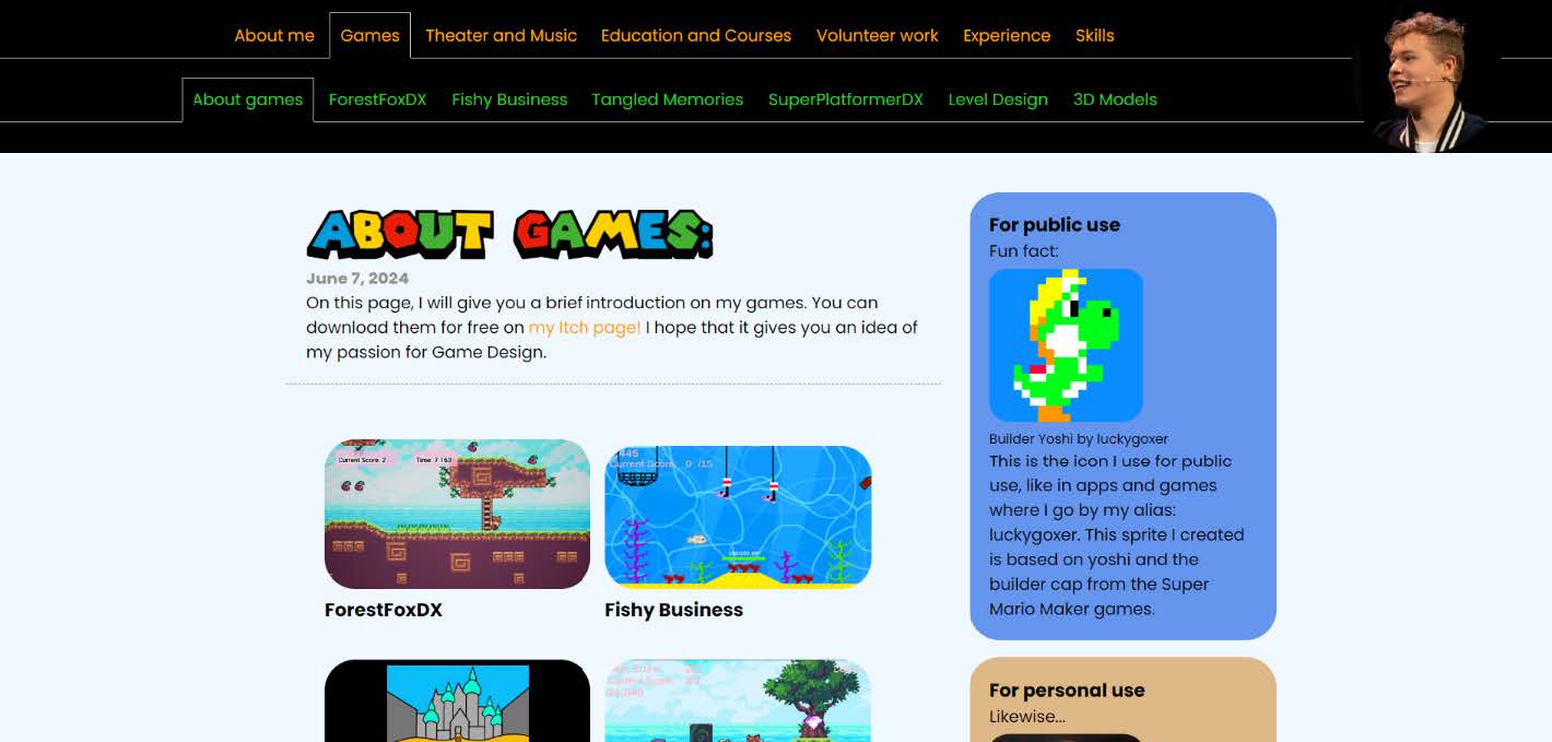
- On the About Games page, add visuals from your games that people can click on. They are more willing to click on a picture than on a word.
- The rest looks good. The theater page is very nice to see.
- Maybe downscale some images for faster loading times, but that is optional.
In the third empathize phase, I processed a lot of the feedback from the last test, like the visuals on the games page for example. People are more willing to click on a picture than on a word. I fixed many bugs as well in this revision. Because I already fixed many things and most feedback was incorporated into my website, this revision is not a drastic overhaul and has mostly small changes. I found it would be helpful to get people to the game pages in some way.
In the define phase, I have been thinking about visuals on the About Games page for people to click on. This way they will immediately know what pages there are and will be directed to the page they click on.
In the ideate phase, I was thinking about a colored button or a screenshot of the game for the visuals on the About Games page. The screenshot would be the most appealing picture and would display what the page is about.
I have created a professional online presence by creating an online website. This online presence is effective because I can update it frequently and easily. This way, it will stay up to date with my skills and knowledge, so employers know who I am and what I am good at. The Contact Me form and social media links give the easy option to get in contact with me. Also, I can add everything relevant to this website. All my professional experience is shared on this website. The website allows me to create my own style and present myself in a fitting way to the industry. Also, the fact that I created this website myself using HTML & CSS can testify to my skills.
Next
After the personal branding module, I continued to expand my website. I have integrated my Unity games directly into this website for example. I have added JavaScript to check if the website is visited on a mobile device or not, to remove these integrated games on incompatible platforms for example. I have also added a small vertical navigation bar using JavaScript that can appear and disappear when the logo is clicked, so it will not always be onscreen and take up half of the screen length. I plan on continuing to support and improve this website for as long as possible.During this project, I learned a lot about Research, HTML, CSS, JavaScript, Web Design, UI / UX Design, and Gathering and Applying Feedback.
CrossExamined International
From January 15th, 2024 until November 10th, 2024, I have been a part of CrossExamined International.
Specifically, the team for CrossExamined Dutch.
CrossExamined is an American organization focussing on Christian apologetics.
Their vision is to reach people worldwide with the gospel of Jesus Christ.
Here I functioned as an Assistant Manager, Graphic Designer and Web Designer.
As a Web Designer, I have helped bring the websites of CrossExamined Europe
and CrossExamined Dutch come to life,
by creating styles and lay-outs, fixing bugs, checking grammar and spelling, etcetera.
During these project, I further developed my skills in Research, WordPress, Web Design, UI / UX Design, Gathering and Applying Feedback, Business Thinking, and Teamwork.